Choosing a brand image and identity is a corporate nightmare experienced by every big corporation. What will fit the brand the best? Will it align with our values? How will it affect the public perception? Does the logo even look good?
The Digital Media department at BVU faces those very questions in its attempt to find a logo to best pull together its unique presence on campus. After many scrapped ideas, revisions, roadblocks and many, many, many hours in Adobe illustrator, specific values have emerged that I believe should be in the design.
An Element of Three
The Digital Media logo is meant to bring together the three Digital Media organizations unified under one symbol: The Tack, BVTV, and KBVU. It should utilize this in its design motif.
Colors of the Three Organizations
There are only a limited number of colors that can go into a logo. Using only the organization’s colors advances the idea of unifying the department.
A Sense of Growth, Forward Momentum, or Production
As organizations that share the common themes of producing media and telling stories, the Digital Media logo should reflect this. The shape should in some way have elements of a continuation.
These are important to keep in mind as we look at the three designs that I believe hold potential to be foundations for the ideas of the Digital Media logo design.
DESIGN 1
The Flower
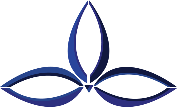
This first option is based roughly off of the Celtic symbol for three, with three ‘leaves’ or ‘feathers’ coming out almost like a plant. The plant-like appearance represents growth and production as well as the location where the organization has its roots: Iowa. It displays the colors of the organizations interlocking with each other signifying collaboration and unity.
DESIGN 2
Pixel Play Button

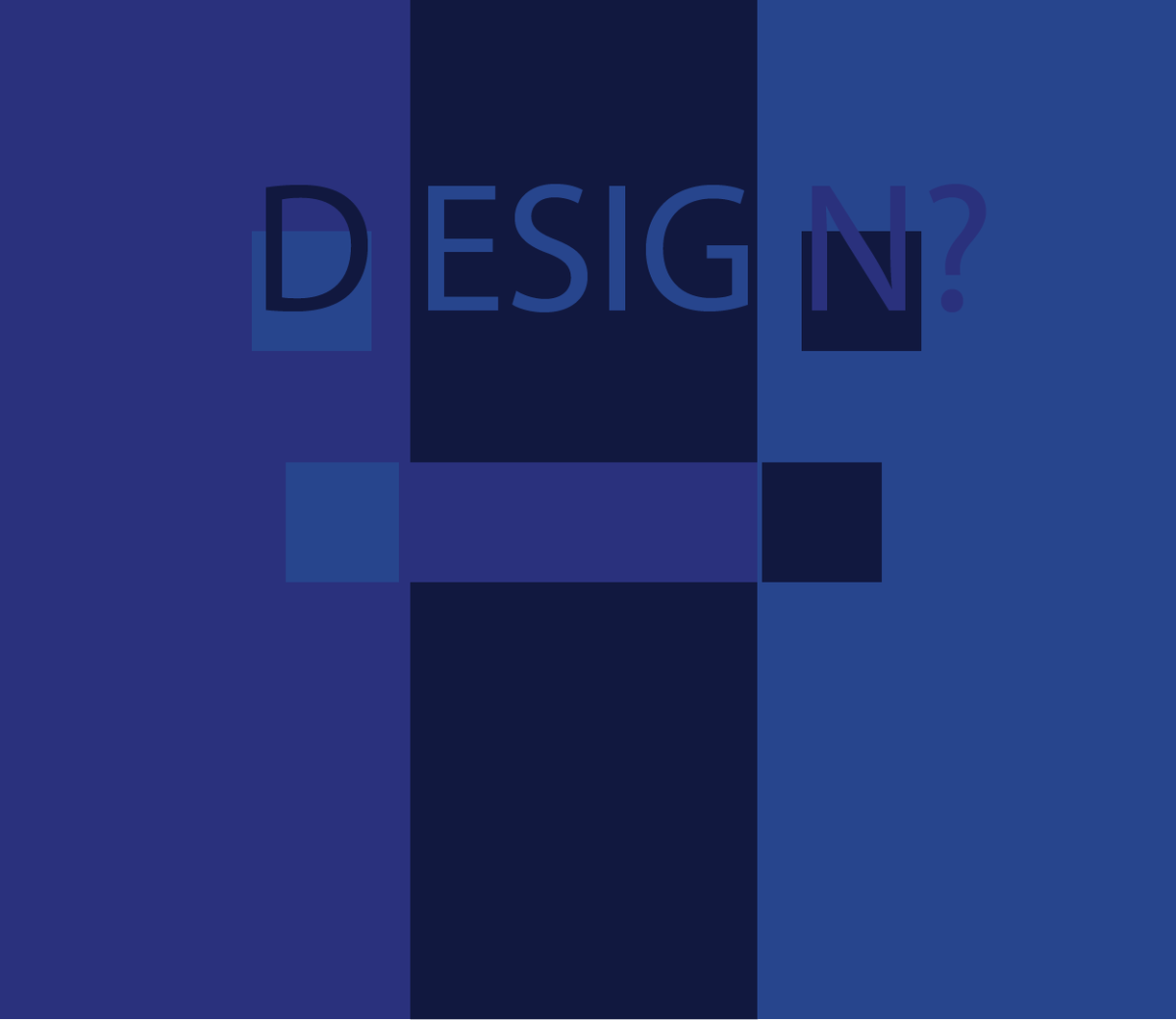
Very simple in nature, this design consists of only three squares, or ‘pixels.’ Each of the three pixels is an organization color. When put together the three shapes take the form of a play button, meeting the requirement for momentum or going forward. This design also priorities the individuality of the different organizations under the broader name, Digital Media.
DESIGN 3
The Forward March

This design prioritizes the creativity, movement and production of Digital Media. Its fluid curved shape gives the logo life and momentum along with its ability to be perceived as many different things. The ambiguity of the shape leaves it up to the viewer to process and discern what the shape may be, but the core messages stay the same. It has three parts, three colors, and a sense of forward movement.
One of the most important elements of design is the viewer’s perspective. This is why I’ve decided to do this beta test with the three logos I discussed.
Now, seeing these three designs, which of these logos would you vote as the best?



Maureen Murphy • Jul 24, 2024 at 6:06 pm
The connecting pieces sharing all sides feels like the most unity between the separate parts of the same organization.